So you know how to shoot mono? Try our challenges
Photographer and creative director Dom Salmon is bonkers about black and white. Here he shares some tips, tricks and takes to help you take your desaturation game to the next level
The first true photographic representations of the natural world were in black and white. That’s because the nascent technology needed a lot of light to function and had only one layer of ‘film’ (then on glass plates) to work with. Essentially one colour, or monochrome.
From the day the clever Lumière brothers had the idea to dye potato starch molecules red, blue and green for their Autochrome process, inventing the first colour photographic medium, we could start to reproduce the world around us much more as we were seeing it with our own eyes.
So, time to leave the one-dimensional black and white world behind, right?
Not at all. To this day, black and white images still have a hold on our imaginations way beyond simple nostalgia. From the stark contrast of a shadowy street shot, a moody portrait or the grainy style of classic reportage, it’s an instantly evocative look — and one that can help create a strong narrative. It’s still used in movies, too. Check out Christopher Nolan’s use of it in the ‘trial’ section of Oppenheimer.
In a culture of super-brightly coloured, deeply saturated imagery, it’s certainly a device that really stands out and grabs our attention. But there’s way more to a great mono shot than simply turning the colour off.
Compare and contrast
To me, black and white is all about finding contrast in a composition. Those deep dark shadows against brilliant brights achieve a stylistic ‘pop’ that can immediately intrigue and attract the viewer.
Scratch the surface
Shorn of colour, you can really explore the textures in front of you. Patterns, shadows and surfaces take on a whole new visual identity that can be a very strong compositional influence in a shot.
Creative compositions
There’s something about black and white that can free your framing from ‘traditional’ concepts. Photographers such as Bill Brandt, Fan Ho and Man Ray used huge swathes of ‘nothing’: deep, impenetrable black areas that produce an amazing frame-within-a-frame in their photos, pushing the image to almost total abstraction.
Moody and magnificent
This is the hardest black and white quality to quantify. But think back to the 1940s film-noir genre, all Venetian blind shadows on faces and menacing figured in dark corners. Nothing adds drama and mystery to your image quite like stark monochrome.
So black and white is an incredible creative medium to work in, but how do you make the most of it?
Fantastic Nikon Z f
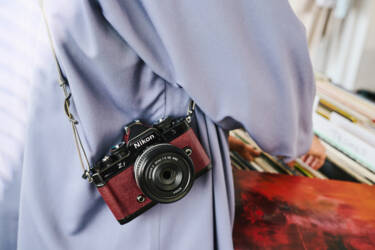
There’s a lot to love with Nikon’s latest Nikon Z f camera. Its retro good looks are a hit with Nikon film shooters like me, and also a new legion of fans who love the combo of sleek old school analogue style on the outside with some serious modern tech under the hood.
My favourite feature? At the flick of a switch (instead of going through the menu), you’re in monochrome mode and in doing so you can stand on the shoulders of legendary Nikon black and white photographers such as Don McCullin and Annie Leibovitz.

Best of all, the viewfinder switches to mono, too! One of the hardest skills to learn is how to ‘see’ a shot in your viewfinder and mentally convert it to black and white, so this is super handy in helping you visualise without colour.
The Z f’s mono ‘look’ comes in three flavours, from a neutral feel (monochrome), through a soft contrast look (flat monochrome), all the way into something starker, classic film-like styles (deep tone monochrome) you can dial straight into. Oh, and it keeps a colour version of the file, too, so you’re spoilt for choice.
Post-it notes
The most common way to go black and white is to alter an original colour picture in ‘post’ via an image manipulation programme such as Adobe Photoshop. For this, I personally use Capture One, which is very similar to Adobe’s Lightroom, but with all these apps, you’ll be amazed how a few simple adjustments can lift a bland colour image into something quite startling. Don’t forget you can try out Nikon’s own image viewing and editing software, NX Studio, for free.
Read more: 6 beginner tips to know before you start editing photos
RAW power
First things first. If possible, use the RAW format in your camera. This digital ‘negative’ holds tons information, which is great for when you want to pull up some detail that’s not that visible at first, especially in shadow areas. But, it can also allow you to smash the hell out of your picture with some pretty extreme processing and get really drastically dramatic results.
Let’s demonstrate that. Meet Jean.
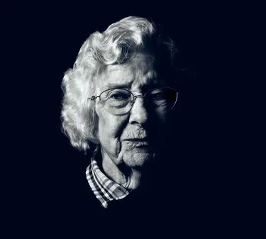
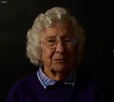
You may be thinking it’s ‘OK’, but it’s a bit meh…Well yes, this is the RAW untouched file straight out of my Nikon Z 6II, and whilst it won’t set the world alight as is, I had a sneaky plan all along to do something quite different in Capture One.
Big difference! There’s a lot of later detail I’ll do, such as losing stray hairs, but the main image layer has some pretty mighty corrections from the off.
Read more: Why photograph in RAW?
Colour me bad
First up, there’s a lot more to a great black and white shot than simply removing the colour. Many photo adjustment apps allow you to manipulate exactly how the image’s individual colours actually change to black and white.
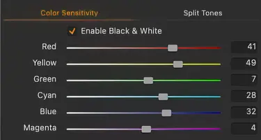
You can see from this screengrab of my Capture One sliders, I’ve asked the app to treat some colours as ‘brighter’ (higher numbers) than others. So, the red and yellow parts of Jean’s skin tone are pushed with their sliders to be almost white. The reason being I underexposed the image slightly to give me more headroom and flexibility later, so in the conversion, I’ve reclaimed some brightness and pushed the contrast between red/yellow and the bluer/greener colours.
Digging deeper
That helped me get the image into the black and white space with a bit more control than by simply turning the colour ‘off’. After that, it’s time to use some more specific parameters to help tailor the image further.
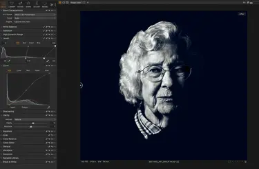
The above is a screen grab of my app’s screen. In the left-hand bar, you can see the other processing I put in at this ‘base’ stage.
1. Levels
You can see I’ve dragged the sliders in from the left and right edges. Like with a punchy drum track, this really squeezes (compresses) the contrast of the image, focusing its dynamic range and adds instant impact. The lack of very bright areas in the original (the right side of the histogram is very flat) is a plus, as I was able to be quite extreme in how far I’ve pulled the slider in from the right, so there’s a lot more brightness even in the mid-tones. Meanwhile, I’ve rendered everything already fairly dark as a solid black.
2. Curve
The curve tool is great for adding a subtler contrast. You can even tweak individual channels like Luma (light) or the red, green or blue spectrums, but here I’ve introduced a very slight ’S-curve’ line across the whole RGB range to refine the big correction I’ve made in levels to suit the image. Again, just looking to bring a bit of overall brightness back and introduce some contrast.
3. Clarity
I love this tool to add a spice on the base image level (sometimes I add it only to specific areas in its own masked layer). Clarity adds a little ‘bite’ to an image by increasing the contrast between adjoining light/dark areas in its mid tones. It can really help increase texture and detail presence.
So, a few simple tools applied, but a huge change in ‘everything’ — look, feel, mood, impact, composition. Capture One’s handy ‘before and after’ slider shows this change side-by-side.
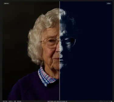
So, if you think ahead, you can develop a very different look and feel by making the most of monochrome.
Challenges
Feel ready to see things in black and white? Here are some devious (but fun I hope) creative challenges….
Beginner
The hardest thing to change is your mindset and think in black and white. If you have a camera like the Z f and can just switch to shoot in a totally mono environment, great. If not, try these challenges to help you get into the desaturated swing.
Street style
The history of reportage photography is rooted in black and white, so what better way to get yourself in a mono mindset than a ‘documentary’-style challenge? Here’s an image I took when I walked round a London market at lunchtime and photographed food vendors. The guy’s dark T-shirt merges him into the background, while strong sunlight gives a powerful contrasting area. This helps you focus on his eyeline to what he’s cutting by splitting the image into two areas: light and dark. Colour would have been a significant distraction here. By subtracting it, it’s an example of ‘less is more’.
Challenge: Hit the streets to find yourself a subject or place to document.

Flash forward
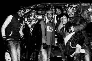
In colour, an on-camera flash can be overpowering, harsh and unforgiving, but black and white is all about contrast. Wait until sundown and use an on-camera flash to add punch and power. This gives an image a freeze-frame ‘capturing the moment’ feel. Check out these tuk-tuk drivers hamming it up for the camera.
Challenge: Find shaded spaces, or head out after sunset and throw some light on the subject.

Enthusiast
Stark contrast
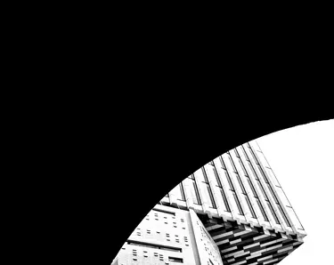
The streets are great for mixing contrast levels.
This image I shot in London simply wouldn’t work in colour, but having the arch of the bridge I was under as a huge area of plain black adds a strong compositional, almost abstract element.
Challenge: Alter your frame and composition with competing areas of strong contrast – don’t forget you can crank this difference further still in post to enhance the overall effect.
Sundowners
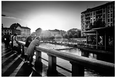
When the sun is low, it can give you super dramatic, long shadows that can add a powerful visual element, Iike the striking patterns of the railings in this photo of Milan, or the long mirror images of these basketball players.
Challenge: Head out just before sunrise or sunset and look for elements that will help create long shadows. Use a wide-angle lens to get low to the ground to add even more impact.
Read more: The ultimate guide to ultra-wide lenses
Pattern recognition
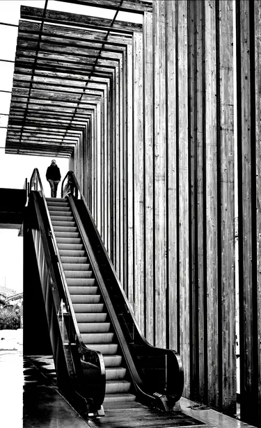
Patterns you might overlook in colour are much more attention grabbing in black and white. Here, I’ve used several repeating patterns that help to isolate our hero at the centre of the image. Coupled with a fantastic wide-angle lens like the NIKKOR Z 24-70mm f/2.8 S or ultra-wide NIKKOR Z 14-24mm f/2.8 S you can add even more drama and dynamism to your composition. If you’re a DX user, try the NIKKOR Z DX 18-140mm f/3.5-6.3 VR or NIKKOR Z DX 12-28mm f/3.5-5.6 PZ VR.
Challenge: Look for patterns or converging lines in your surroundings and use them to lead the eye towards a subject, or even treat them as the subject in their own right.
Advanced
Faking it
Bright sunlight, especially right at the camera, is often a big no-no – too contrasty and stark. In black and white, that can be exactly the look you are after. Don’t overdo it, though. Bright sun, even through a viewfinder, can damage your eyes.
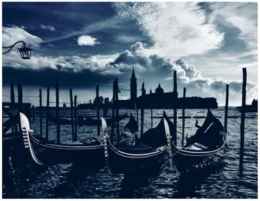
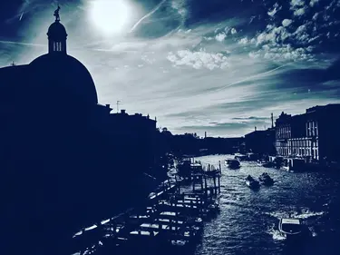
Check out these shots from Venice. They are ‘colour’ photos technically but by using a very low November sun and then pushing the contrast still further in post (again your levels sliders are your friend for this), it knocks out almost any colour, with the very ‘cold’ winter light quality rendering out as a striking dark blue.
If you can make a colour photo look black and white, you’re well on your way to really ‘getting’ what makes a great mono image.
In contrast (pun intended), this indoor image of a window, where I exposed for the light only, meaning everything else fell to black, created an almost abstract image from this architectural detail, the slight coloration of the glass giving a nice ‘duotone’ effect. In both cases, 90 per cent of the black and white was achieved in camera.
Challenge: Use bright overpowering light or expose the light source for silhouettes to make a colour image as monochrome as possible.
Softly softly
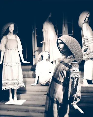
We’ve already seen the effectiveness of super-sharp black and white, but how about at the other end of the scale? Nikon Z f’s flat monochrome profile is great for giving a much subtler contrast curve and so ‘softening’ an image.
In addition, working with your aperture wide open can give a pleasing blur or bokeh, which helps further smooth out the overall tonality of your picture.
Lastly, for a softer image, I like to drag my clarity slider in the opposite direction (i.e. a negative value), taking out that mid-tone sharpness.
This shop display looked a bit sinister when super-sharp. Switching to f/2 and deliberately blurring further in post with a negative clarity setting made for a much more elegant and slightly humorous image.
Challenge: Create a softer, retro feel to your images. Use a wide-open aperture in camera and less aggressive processing in post to take out some of the ‘sting’.
Professional
Here’s a dumb rule: landscape photos should be in colour. Really? Then Ansel Adams would be out of a job! There’s something captivating about a black and white landscape.
Dig out your tripod, some comfy boots, get walking, stop down your aperture (Ansel often went all the way to f/64 and had exposures of nearly ten minutes, so bring coffee, too) and photograph! Thinking in black and white will make you hunt for textures and patterns in nature. And if you embrace these forms fully, you can turn nature into an almost abstract image.
Challenge: Channel your inner Ansel. Without colour, look to pick out the underlying forms of nature – contrasty cloud patterns, the ripples of the sea – and really zero in on their character in your frame.
Up close and personal
Just as with landscapes, removing colour can be powerful in a portrait. It can be attention grabbing for your audience — after all, for decades, photographers only had black and white to tell a subject’s story, which is why it’s so hard-wired into photography’s history.
Check out these images – some are bright, some are moody, there’s soft contrast, hard contrast, a single flash or multi-flash, just sunlight from a window, super-sharp and shallow focus). The only common currency is they are all monochrome.
Challenge: However experienced you are, there are few greater things in photography than feeling you’ve nailed a mono portrait that really captures your subject. If you’ve forgotten that magic, time to reconnect with a bit of portrait history and DNA. Drag your friends over and see what you can reveal about them in glorious black and white! If they refuse, there’s always a self-portrait.
Relax, it’s just for fun
For these challenges, don’t be put off by tags like ‘Advanced’. It’s just that each requires a little more experience than the last. That said, I think a professional can have as much fun as a beginner trying out the ‘stark contrast’ challenge, and, likewise, if you are a beginner, don’t be afraid to shoot for the ‘professional’ challenges, too!
You might get frustrated if some things don’t turn out the way you hoped, but, take it from me, that will never totally change. The only reason I felt ready to turn professional was because I found I was keeping more images than I was binning. Maybe I was on to something…
Treat all these challenges as something fun. There are no ‘wrong’ pictures you can take doing them either. If you like them, that’s good enough. And you’ll never be done. I challenge myself with ‘beginner’ things like street style and flash forward all the time, and still get things ‘wrong’!
It’s right there in black white
In the end, black and white has an eternal hold on the human imagination. Over a century after colour photography became possible, and decades since it was a practical medium, we still see monochrome images everywhere.
Outside of stills, modern movie blockbusters like Mad Max: Fury Road had a totally mono version cut created, which is a startling alternative version to a modern classic. (It’s amazing what mono can do, though I imagine neon-pink masterclass movie Barbie won’t be quite so effective in black and white).
Ocean’s Eleven director Steven Soderbergh cut a black and white, no dialogue version of Raiders of the Lost Ark just to demonstrate Spielberg’s genius for composition and blocking, because mono revealed the underlying structure of the film very effectively.
The popularity of the Nikon Z f and its mono modes demonstrates our continuing affinity for this medium. I mean, even your super-duper mega-pixel smartphone still has a black and white filter for photos!
So, there’s no excuse. Pick a challenge and get out there. And when you’re done, pick another!
See you soon for the next instalment of this exciting new Nikon series…
More by Dom Salmon
Discover our Photo Finish series
So you think you know long exposure? Take our challenges to find out
So you think you know how to photograph in the snow? Take our challenges to find out
For limitless creativity

